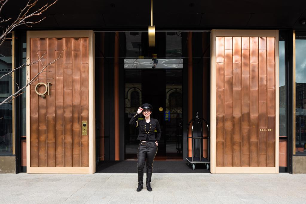
QT Perth – Western Australia
Western Australian colour, mining-boom glamour and full-volume QT theatricality in the heart of the city
Why DNA Hotels Loves It
● Nic Graham turns Western Australia itself into the design brief, with Jarrah timber, opal-like rugs, mineral colours and local flora woven into QT’s signature maximalism.
● The 184 rooms push the mood further with black cockatoo bedheads, saturated velvets, brass and black marble — playful, polished and completely committed.
● Santini Grill and the rooftop bar make this more than a place to sleep; QT Perth is designed as a social stage for the city.
Perth, Turned Up
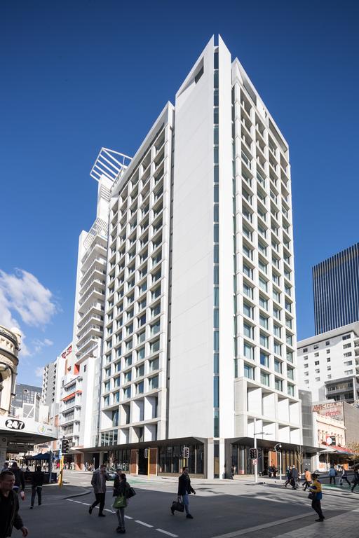
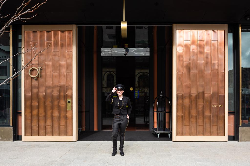
QT Hotels has never been interested in disappearing politely into a city. QT Perth certainly doesn’t. Opened as the brand’s tenth Australian and New Zealand property, the hotel sits beside Murray Street Mall in the CBD and arrives with everything QT does best: colour, theatre, art, pattern and a slightly mischievous sense of luxury. But this isn’t generic QT transplanted west. Designer Nic Graham used Western Australia as the starting point, pulling inspiration from the Outback, the state’s mineral wealth, native flora and even Perth’s more extravagant 1980s mining-boom years. The result is exuberant, but rooted.
Jarrah, Opals and a Lot of Attitude
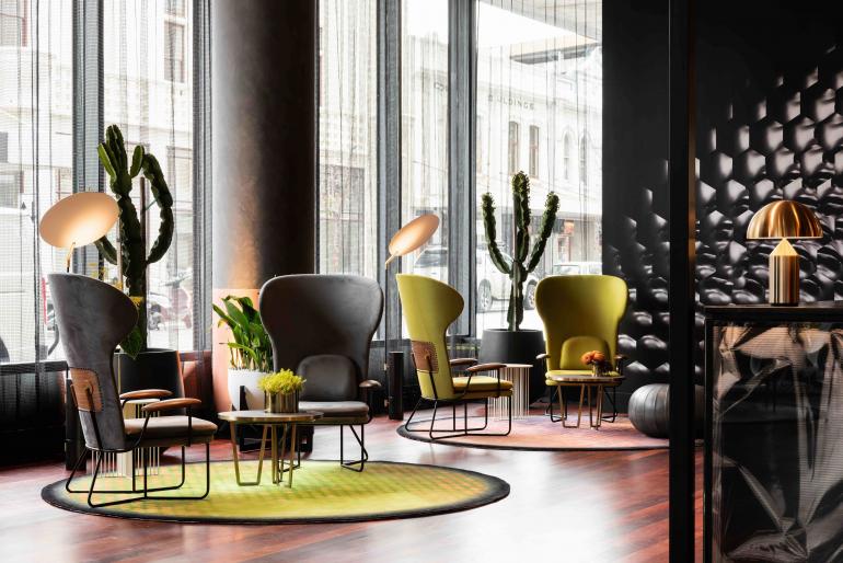
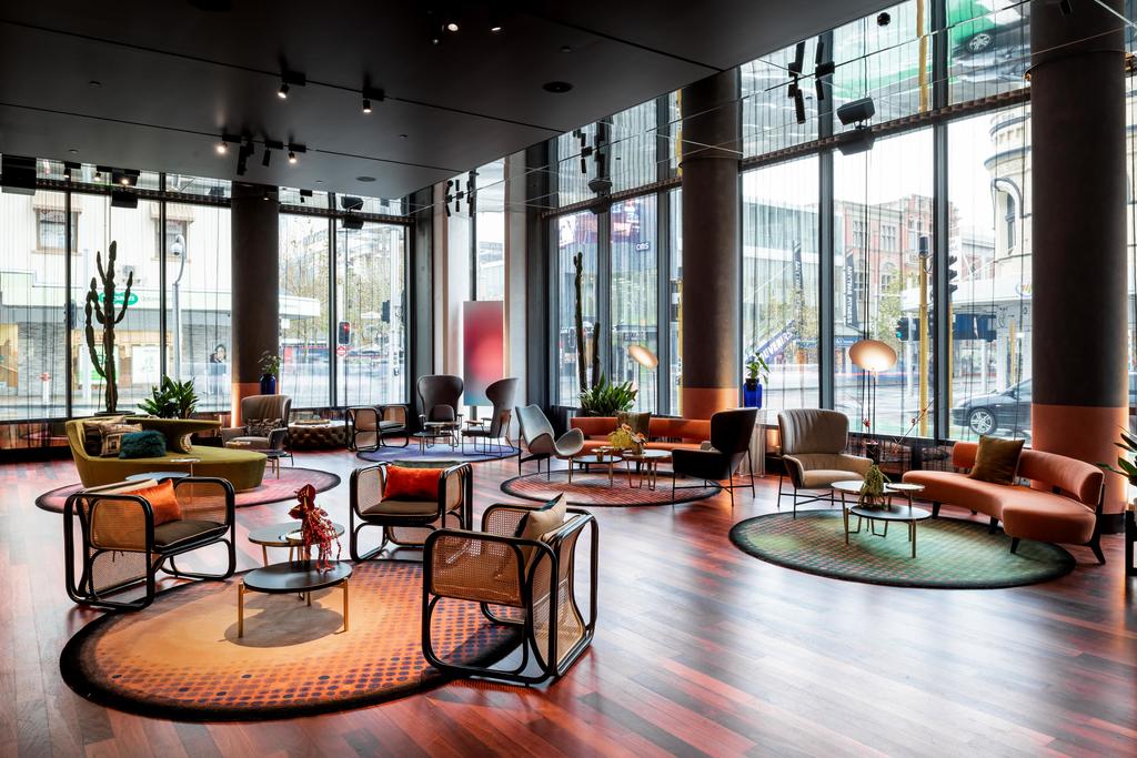
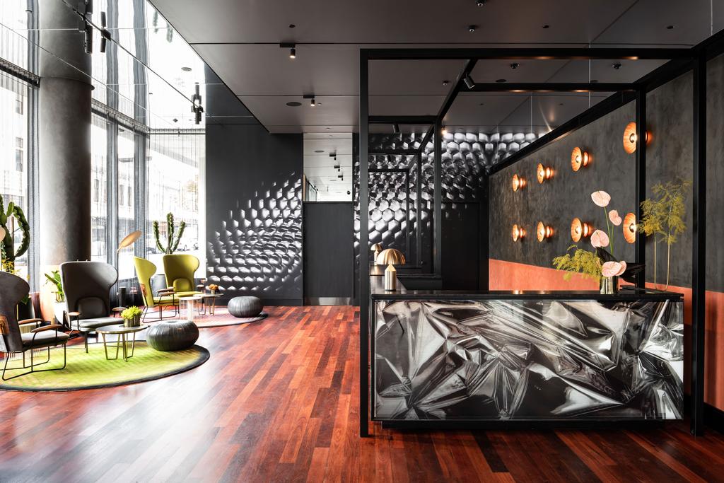
The lobby sets the tone immediately. Deep red Jarrah floorboards reference Western Australia’s earth, while iridescent rugs shimmer in opal-like mineral colours beneath a collection of sculptural furniture. Mid-century references run through the space, but nothing feels reverential. High-backed citrus chairs sit beside curved lounges and reworked Featherston pieces, while Graham’s custom furniture for QT in collaboration with Stellar Works gives retro forms a sharper contemporary edge. The palette is lush. Green, red, violet, gold. Subtlety was clearly not invited.
Mining Country, Reimagined
One of the cleverest things about QT Perth is how strongly the interiors draw on the landscape without becoming literal. The colours reference minerals, wildflowers, red soil and precious stones. In the bar, mirrors and reflective surfaces introduce a deliberate Midas-like excess, a nod to Perth’s heady mining-boom years. Elsewhere, local botanical motifs appear more quietly in wallpapers and decorative details. It’s Western Australia interpreted through glamour rather than geography. No dusty boots required.
184 Rooms of Controlled Excess
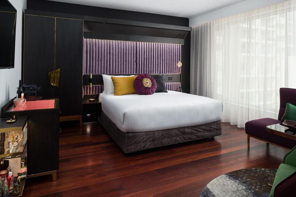
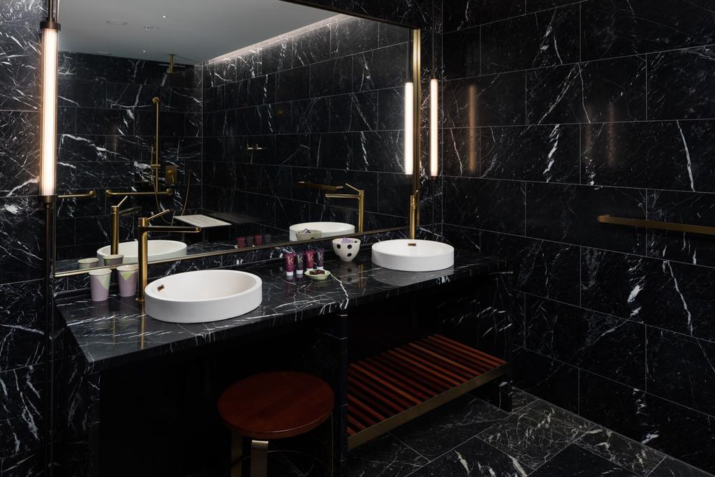
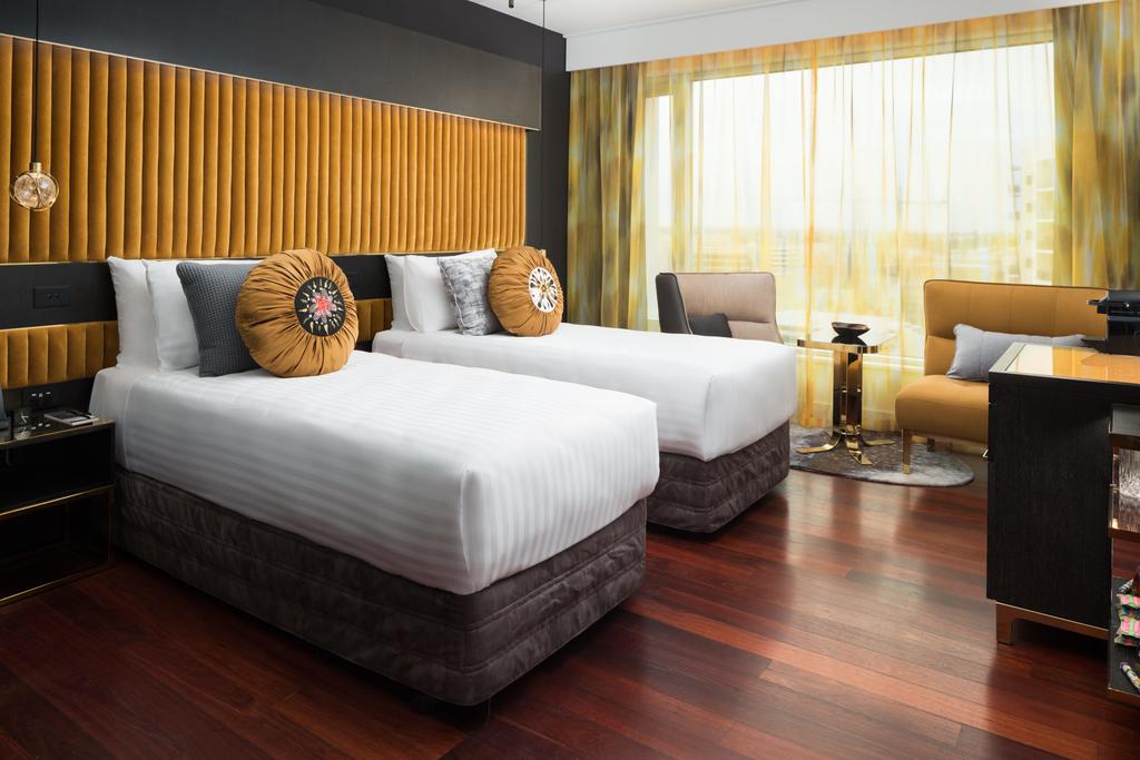
The 184 guestrooms continue the same visual language. Hallways already prepare you for what’s coming, with faceted jewel-toned carpets designed by Shelley Indyk with Sydney artist Claudia Damichi. Inside, the rooms become darker and more decadent. Saturated velvets in emerald and violet meet brass detailing, sculptural lighting and black marble bathrooms veined in white. Then come the playful details. Black cockatoo bedheads sweep across the walls, while abstract black-steel artworks by Canberra artist Patsy Payne take inspiration from aerial views of rivers and salt pans. QT’s sense of humour is never far away.
Bathrooms with Drama
If the bedrooms flirt with decadence, the bathrooms commit. Black stone surfaces, strong veining, oversized showers and gleaming metallic details make them feel closer to private dressing rooms than functional hotel bathrooms. Depending on the room, freestanding tubs add another layer of indulgence. Nothing here is designed simply to disappear into the background. Even brushing your teeth gets a set.
Santini Looks West and South
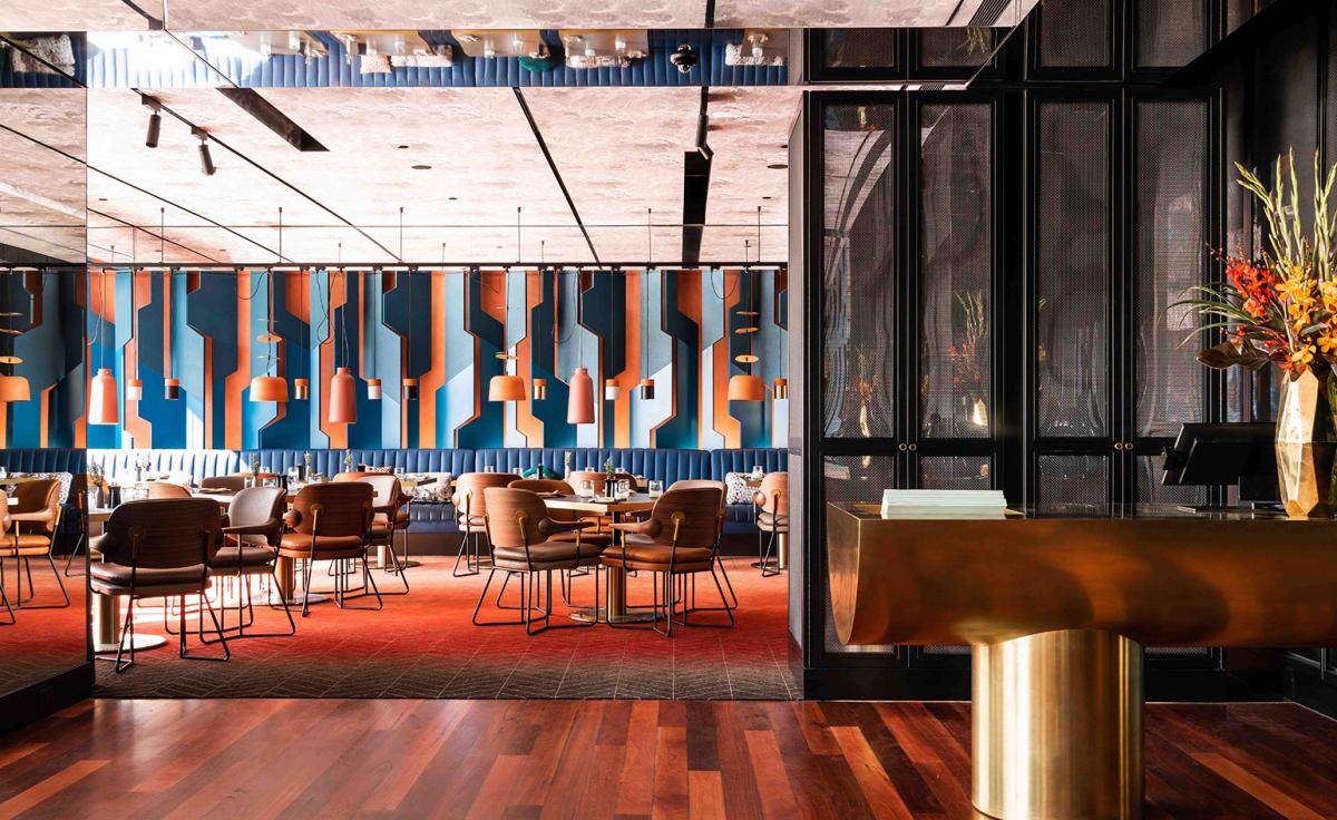
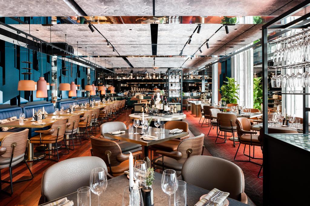
The hotel’s main restaurant, Santini Grill, introduces another clever collision of references. Its terracotta and turquoise palette obviously makes sense for modern Italian cooking, but Graham also used it to echo Western Australia’s landscape — the red earth of the Kimberley meeting vivid coastal water. That duality suits the restaurant. Mediterranean cooking, Western Australian ingredients, theatrical interiors. The menu leans toward bold, generous Italian flavours rather than overworked hotel fine dining. Exactly right for QT.
A Rooftop Above the CBD
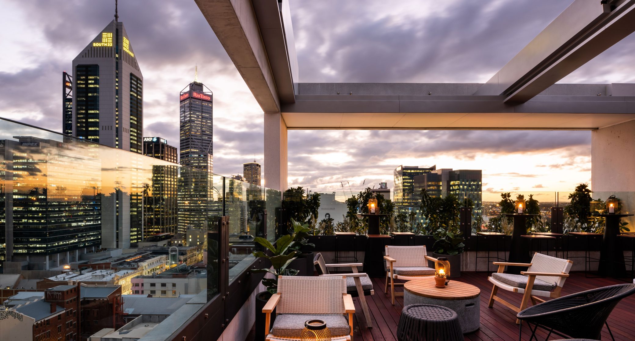
Then there’s the rooftop. Perched high above the city, QT Rooftop gives the hotel one of its strongest social draws, with wide views across Perth and towards the Swan River. By late afternoon, it shifts naturally into aperitivo territory. Then music, cocktails and night-time energy take over. It is less rooftop sanctuary, more urban theatre. The skyline becomes backdrop. The crowd becomes part of the set.
The QT Formula, Done Properly
QT hotels work best when they don’t feel like a brand template. Perth succeeds because the local references are strong enough to shape the personality of the whole property. Jarrah. Minerals. Black cockatoos. Wildflowers. Mining glamour. Red earth. Opal shimmer. None of it is particularly quiet. But that’s the point. QT Perth understands that some destinations deserve restraint — and others deserve a little spectacle. In this case, Western Australia gets both local character and a very polished dose of showmanship. Bold, theatrical and unapologetically indulgent. Exactly as QT should be.